
No Big Deal (App)
No Big Deal is a startup based in Luxembourg that focuses on rewarding users based on movement and physical activity. Whether it’s a short walk or a long run, No Big Deal focuses on rewarding daily achievements. Users complete challenges to earn free gifts, discounts, or even to help the environment. Learn more about No Big Deal here.

Background.
Understanding the problem.
No Big Deal identified a few issues they wanted to address:
Although they had a lot of users, the number of people who actually claimed rewards were limited. No Big Deal wanted to find a way to increase these conversion rates.
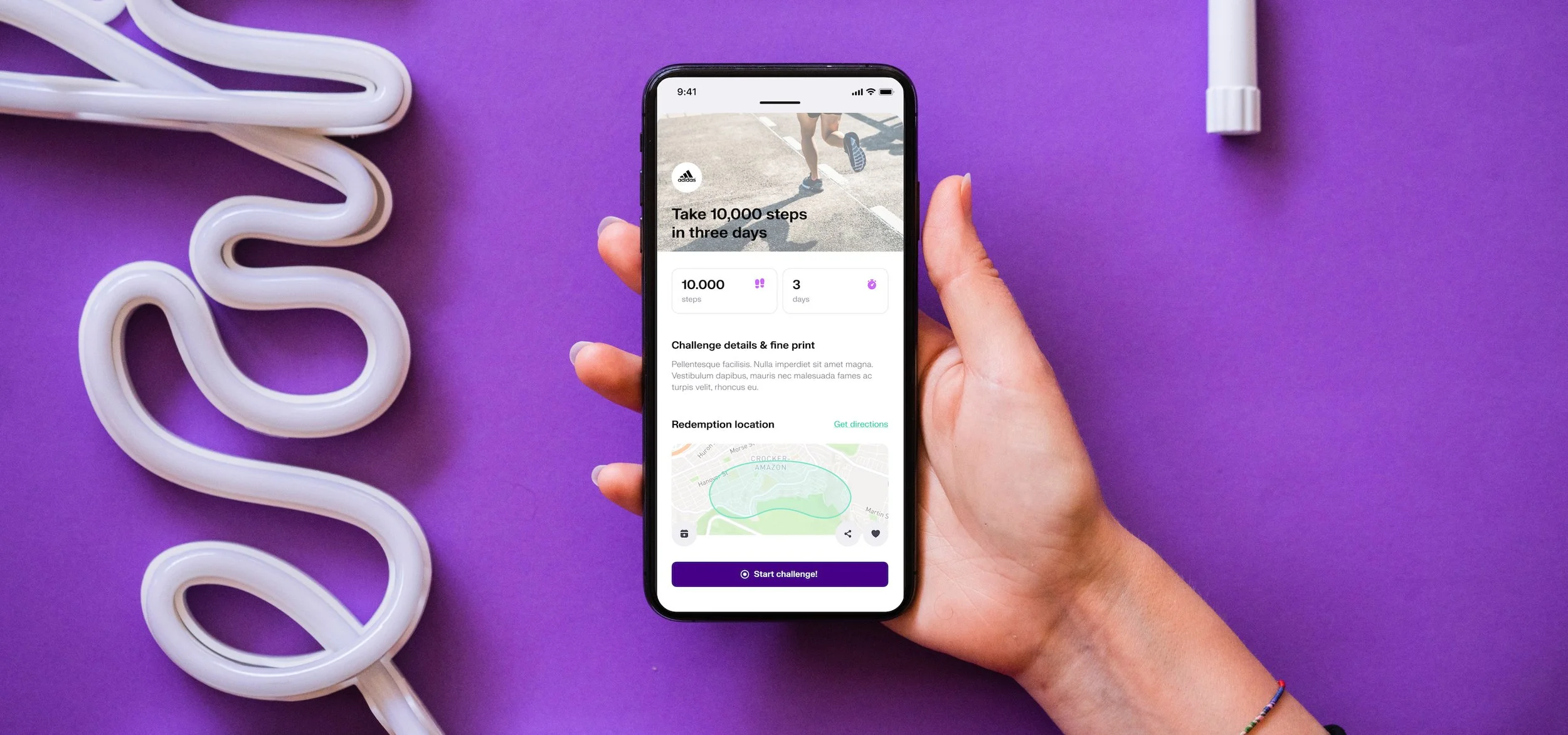
The original design was felt like a discounting/couponing app, but No Big Deal wanted to be a lifestyle and achievement brand with focus on helping the user feel good about themselves. As part of a focussed rebranding, No Big Deal needed a new user journey that would align with the new concept.
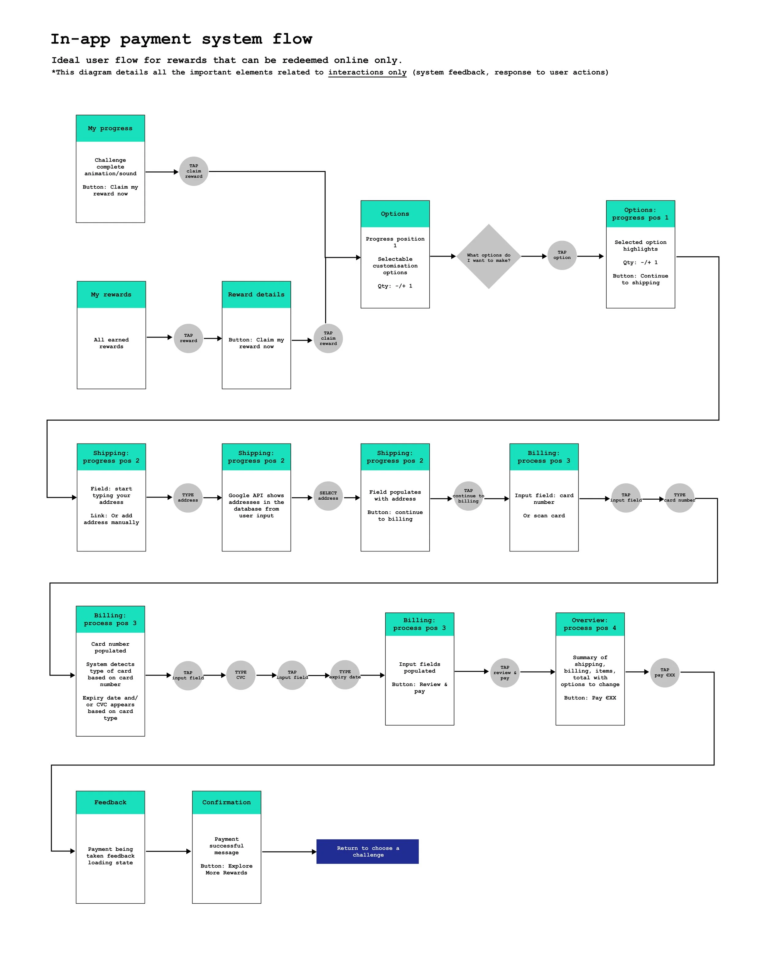
They also wanted to implement an in-app payments system for retail rewards.
The hypothesis.
After speaking with some users, my hypothesis was that the element of achievement was not emphasised enough, and didn’t encourage users to claim the reward. There were also a few un-intuitive interactions and an unclear flow that made the journey feel incomplete. To address this, the entire concept and flow was redesigned to feel more like a game, with achievement at the forefront.
My role.
My responsibility was to investigate the original user flow and redesign a new one, with the goal of increasing conversion rates. I also worked with the founding team and the UI designer, to design an ideal user journey that would match their new branding concept.
Interview current users as well as new potential users.
Complete executive notes to summarise research and suggestions.
Design a user flow for new concept, with focus on achievement and encouraging reward conversion.
Create a customer journey map.
Create a high fidelity prototype and wireframe for development.
Design a user flow to in-app payments system.

Research.
Talk, talk, talk - to your users!
Since No Big Deal was already an established product, we had an advantage in being able to talk to current users. Asking users in-depth about their experiences and problems they faced was the most important step in improving their UX.
Gathering user context and background.
Interviewing current users helped me understand the demographic of the average No Big Deal user, what they liked and disliked about the current experience, and why they might not be using the app in the way the founders had hoped. Talking to potential users also helped me to understand how an unbiased (new) user used the app.
.

Design.
The main considerations.
The current app lacked the feeling of a complete journey. Taking inspiration from gaming, we created a flow that gave the user room for personalisation, the ability to unlock new rewards, and emphasised the user’s achievement at the end. It was also an important aspect that the user is then encouraged to repeat the journey, and claim their previously earned rewards.
Designing the ideal user flow.
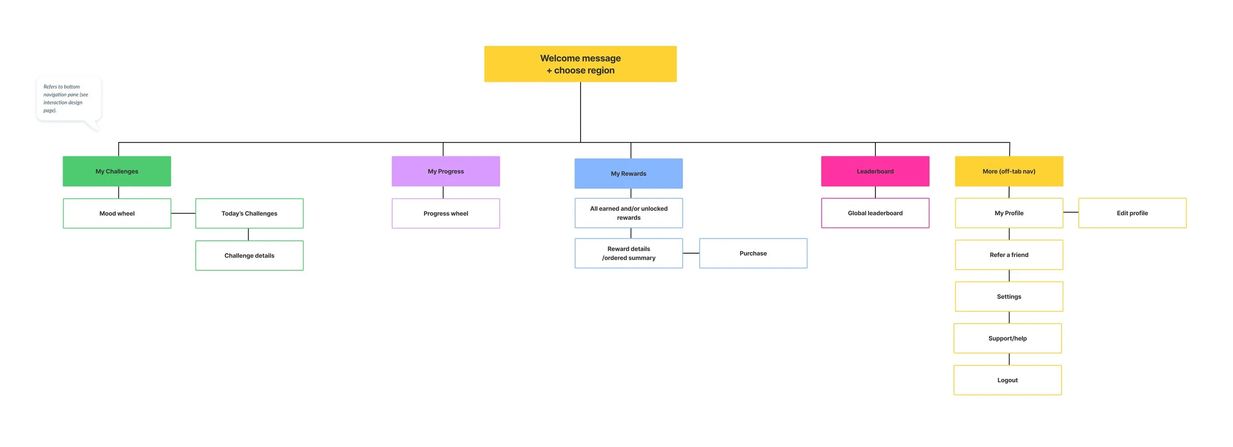
I started by mapping out the information architecture, which laid out all the screens and sections the founding team wanted in the app. This helped me visually see all the parts a user could potentially encounter.
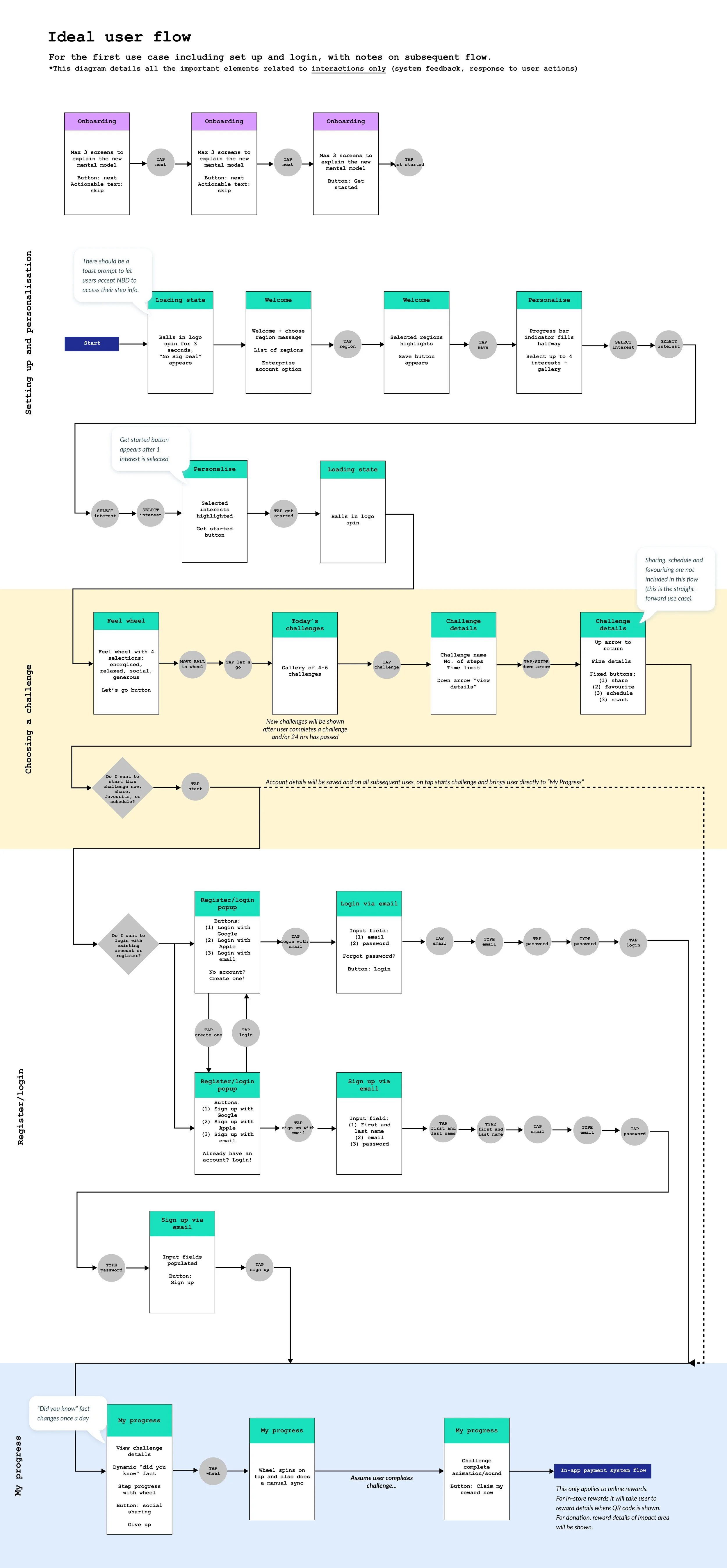
Then I designed the ideal user flow, including what would happen on the first download and how the journey would repeat. I discussed these with the founding team, and once they were happy with the changes, I designed the interactions that move the user through the journey. No Big Deal wanted the app to feel modern and make use of gestures such as swiping, so I needed to implement these in an intuitive way.
I mocked up the interactions in a medium-fidelity prototype and performed usability tests, making modifications as required, before creating a wireframe.
Wireframe.
No Big Deal partnered with a branding agency and a UI designer to come up with refreshed graphics. I worked with the UI designer by taking him through the interactions and placements of elements. He then used this wireframe to create high-fidelity mock-ups, which were then used in the final prototype testing.
.

Challenges.
Getting on the same page.
No Big Deal had never worked with a UX designer before, and wanted to make significant changes in an extremely short time, thus skipping important steps in the UX process. I had to realise it was my job to help them understand the benefits of a full UX process and advocate for best practice. I put together a presentation on what UX design is, proposed an action plan, and how it would benefit No Big Deal.
More features is not the answer.
The clients were quite adamant that more features meant better UX. Getting the core of the app right was the most important, but the team trusted that adding an in-app payments system and a community leaderboard was the key to solving their UX problems. While these were great ideas that would’ve added to value of the app at a later stage, I felt that focusing on these features took focus away from the app’s main function.
As time went on, No Big Deal shifted focus heavily towards edge cases. As a result some screens became more and more complex. At times I felt it was my failure that I was unable to convince them with my advice, but I needed to accept that at the end of the day I advocated for what I thought best, and it was up to the client to make the final decision.
Documenting decisions.
Throughout the process decisions would be made, only to change last-minute during the design phase. The clients would go back on why the decision was made, and I found myself having to re-present the research and justifications several times. In retrospect, I should have documented the decisions and discussions made after each meeting.
Another thing I would do different is restricting edit rights on Figma files. Significant changes were done by other people, without discussion as to why those decisions were made. Even with version control, it was sometimes difficult to get a file back to an organised state, especially if the editor did not have Figma experience.