
FlyUX
FlyUX is a fictitious airlines app which was designed as part of my professional diploma program at the UX Design Institute. All research, analysis, and design stages were conducted by me, allowing me to gain an understanding of the full UX design process.
Feature…
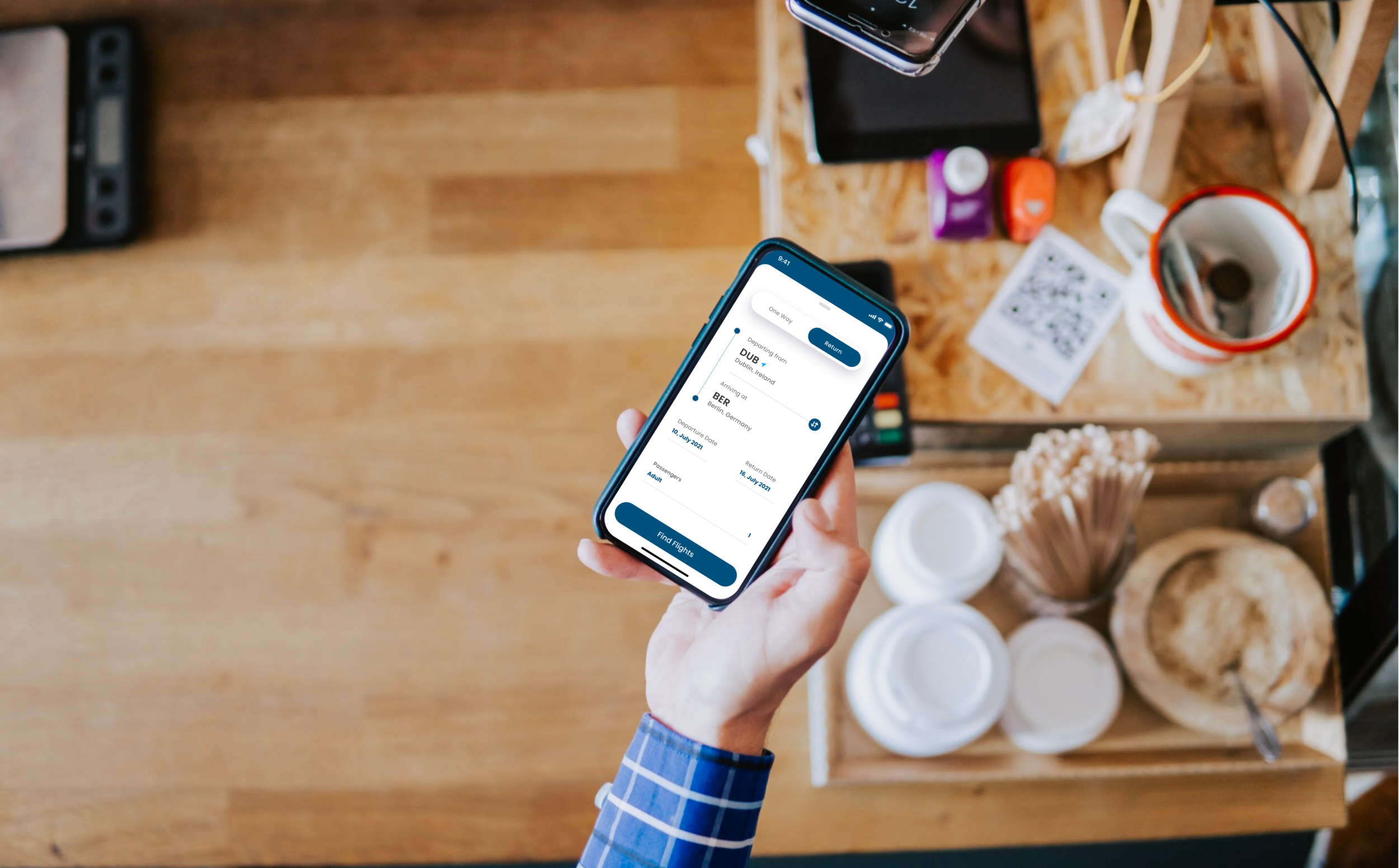
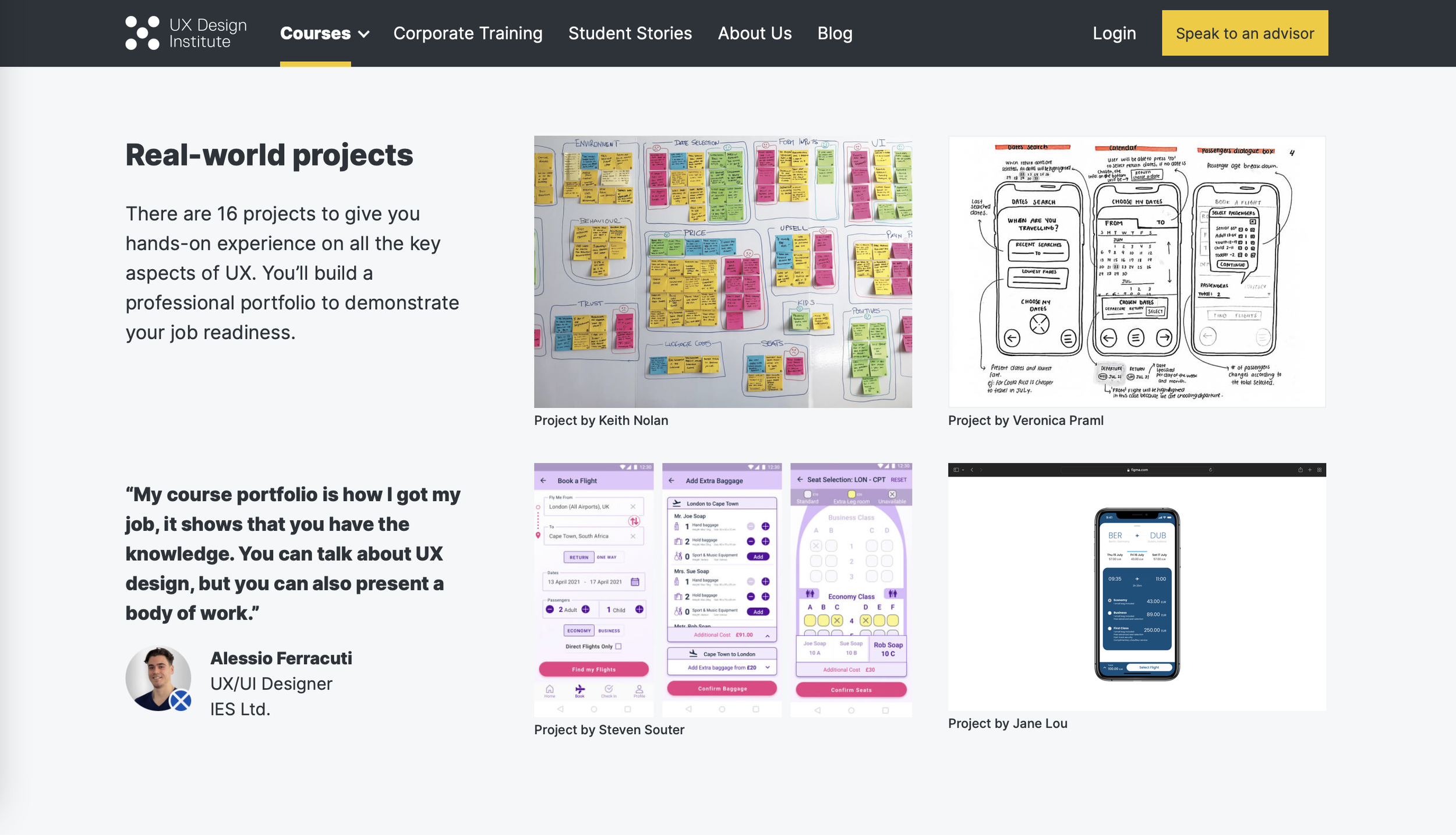
My project was featured on the UX Design Institute website, showcasing my medium-fidelity prototype.

Research.
Understanding the problem.
In order to build an app that is valuable and enjoyable, I had to first understand the users and their behaviours, common paint points, and interactions.
Talking to users.
I wrote and distributed an online survey which helped me understand why people used airline apps.
Watch an example of a usability test on a competitor app here.
Compilation and peer feedback.
Once I gathered feedback from users, I compiled all the information and asked my roommate to create an affinity diagram with me - organising all the information into digestible groups.
Using the affinity diagram, I created a customer journey map of the average user. It highlighted the pain points and positive interactions, user mental models, as well as visually illustrating user emotions throughout the flight-booking process.

Design.
Referencing the research gathered, I started to design interactions and the ideal user flow. I paid particular attention to remedying common pain points and using basic, well-established interaction methods.
Interaction design.
It was determined during the research phase that one of the most common issues in airline apps was unclear call to action. Users were unsure how to select flights and became confused when nothing happened after tapping buttons, usually resorting to trial and error.
To rectify this, I made use of rules such as buttons only appearing after required fields are populated by the user, only showing information as it becomes necessary, and using radio buttons to visually indicate tap targets.
Prototyping
I created a medium-fidelity prototype with no visual branding, allowing the focus to be on the user flow and interactions. Finally I created a wireframe as part of a handover package for developers, which include important details about how parts function, and some back-end requirements.

Challenges.
Modern vs. functionality
I wanted the app to feel modern and sleek, but also needed to accept that given the wide range of users, things like complex gestures didn’t always equate to good user experience. This was particularly true when it came to the behaviours of older users.
Narrowing down the scope.
Flight-booking apps are used by people of all demographics. Everyone had very different preferences and wants, but it would’ve been impossible to cater to everyone. I had to narrow down the focus to the core functionality of an airlines app - booking flights.